

I Built the Production Tool I Always Wanted. It Took a Weekend.
The economics of internal tools just changed. The scarce ingredient is now domain knowledge, not engineering

The tab-switching hour
It is a Tuesday afternoon and I am trying to answer one question: will a casual player actually reach the gate we placed in week three of our live event? The answer exists. It is just distributed across five places.
The design doc has the progression requirements. A Miro board has the player journey we sketched in a workshop two months ago, already out of date. One spreadsheet has session length assumptions. Another has the open design decisions, half of them missing owners. And the last piece, the honest one, is my own gut feeling about how casual players behave, built from years of watching them bounce off content that asked too much.
So I do what producers do. I open all five, alt-tab between them for an hour, and assemble the answer in my head. Then a design detail changes the next week and the answer I assembled is stale.
None of these tools talk to each other. None of them were built for this question. The design doc is for designers. Miro is for workshops. Spreadsheets are for whoever made them, six versions ago. The actual job of a producer, holding the whole picture and finding the cracks in it before players do, has no tool at all.
I have spent a long career around production problems, in games and outside them, and I had never felt this one this acutely before. The reason was the shape of the project: a short event, fast decisions, and a partner setup where every call needed a clear, defensible why attached to it. When the cycle is compressed, the cost of reassembling the picture by hand stops being an annoyance and becomes the bottleneck. At some point during that Tuesday I stopped waiting for someone to build the tool and decided to build it myself.
It took a weekend. That sentence would not have been true two years ago, and that is really what this post is about.
The problem is structural, not personal
It is tempting to conclude the tab-switching hour is a personal failure of organization. It is not. It is what happens when a specific set of conditions stack up, and modern live events stack them by default.
Live game production got harder faster than its tools did. A producer today might run multiple live titles at once, each with its own cadence and community. Events increasingly involve partner studios, where one side owns the brief and the other owns implementation, and alignment happens under time pressure. Layer an external IP on top, with its own lore, approval chains, and brand constraints, and the coordination surface grows again. Meanwhile the toolset has been the same for fifteen years: a document, a whiteboard, a spreadsheet, a ticketing system built for engineers.
Here is the observation that unlocked the tool for me. The core planning questions of a live event look like separate tasks, but they are not.
What does the player experience each week? What design decisions are still open? Does the time math work for each kind of player? Where is churn risk concentrated?
These are four views of the same underlying data. The player journey defines the time requirements. The time requirements against player segments produce the risk. The open decisions are exactly the places where the journey is still ambiguous. Change one and the others move. Which is precisely why keeping them in four disconnected tools guarantees they drift apart, and why the producer’s head becomes the only integration layer.
No vendor builds the integrated version because the market is a rounding error. Hold that thought.
What I built
Over a weekend I built a single browser canvas that holds all four views and keeps them connected. I am a producer who codes, but the honest division of labor is that I supplied the production knowledge and the design of the thing, and an AI assistant supplied most of the implementation. We went back and forth the way I would with a fast, tireless engineer who occasionally needs pointed feedback.
Rather than list features, here is what each view answers.
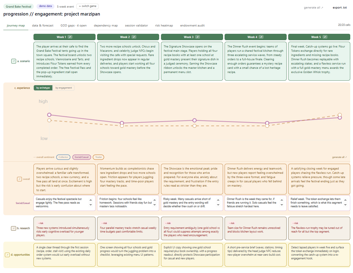
What does the player do and feel each week? A journey map: weeks as columns, layers as rows. Player scenario, emotional experience, research insights, design opportunities. The AI drafts each cell from the event’s design context, and I edit. An emotion curve runs across the top, split by player archetype, showing where engagement peaks and where it sags. The archetype and engagement lenses are not arbitrary, they come out of earlier thinking I have written about on why players engage at all.
Does the time math work? A session validator. Sliders for the design’s assumptions: time per progression stage, stages required, typical session length per player segment. It answers bluntly whether each segment can reach each milestone, under optimistic and pessimistic readings.
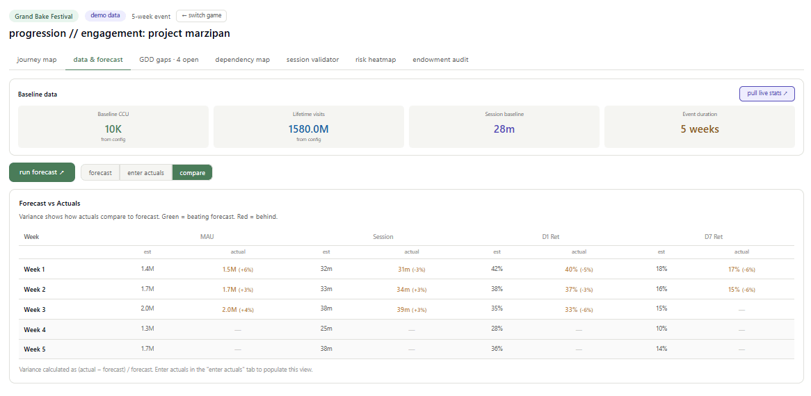
Is the plan surviving contact with reality? A data view. It pulls live platform stats for the title where available, builds a forecast baseline from them (weekly players, session length, retention), and then, as the event runs, takes actual numbers week by week and shows the variance against forecast. The forecast is a hypothesis. This view is where the hypothesis gets checked.
The remaining views are quicker to describe. A gap tracker logs every open design decision with what it blocks and who owns it. And a risk heatmap crosses week against player segment, fed by a dependency map of every gate in the event. The screenshots below do them more justice than prose.
The views feed each other. Edit a journey cell and the sentiment shifts the heatmap. Change a session assumption and milestone reachability updates. That connectedness is the entire point. It is the thing my five open tabs could never do.
One design decision mattered more than the rest: the tool is configuration driven. The event structure, the player archetypes, the week themes, the baselines all live in a config, not in code. Setting it up for a different title takes about ten minutes. I will come back to why that matters.
What it caught
The fair test of a planning tool is not whether it looks good in a demo. It is whether it finds problems before players do. Here is what happened when I ran a real live event through it, a five week event on a major UGC platform, before the design locked.
The gate that quietly excluded casual players. The event had a progression gate in week three. To pass it, players needed to collect a set of items and level at least one of them to a final tier. The session validator does simple math: time per progression stage, stages required, multiplied against how much time each player segment actually has in a week. For engaged players the math worked fine. For casual players, the ones who play in short bursts a few days a week, the optimistic path still came out at eight to twelve hours before the gate. They were going to arrive at week three locked out of the event’s centerpiece.
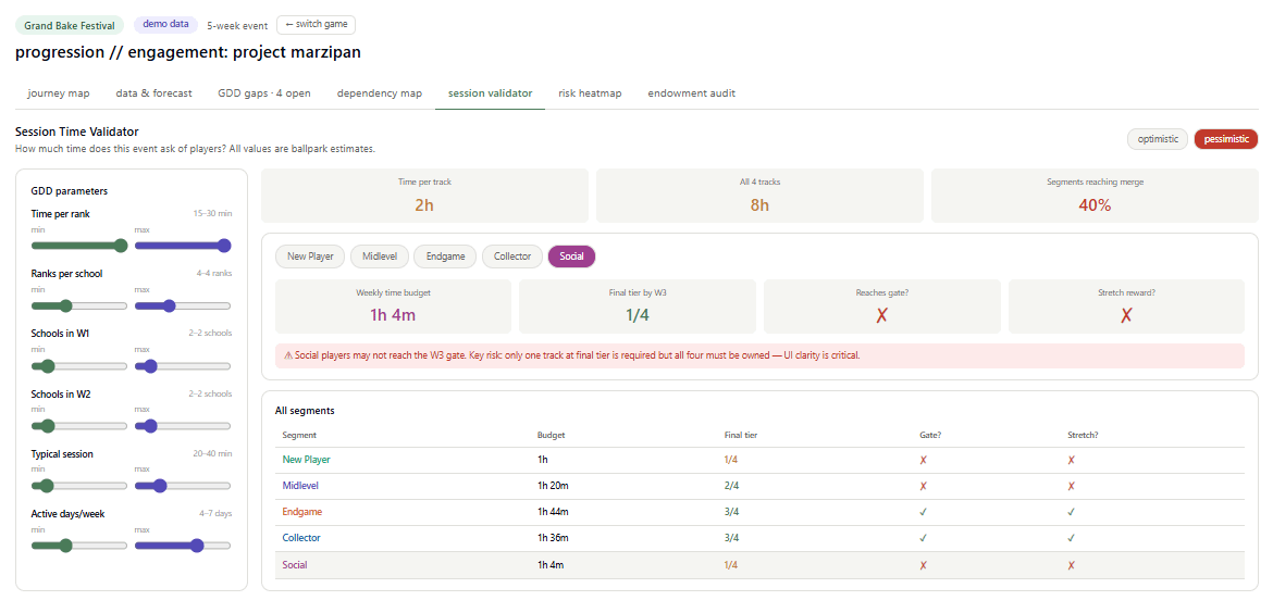
That alone was worth knowing. But mapping the gate exposed a second, sneakier problem. The actual requirement was to level only one item to final tier while holding the full set. The interface, as designed, could easily be read as requiring all of them at final tier. A casual player who misread it would look at the requirement, do their own version of the session math, and conclude the event was not for them. Quadruple the perceived cost of a gate and you do not get frustration, you get quiet abandonment. That distinction, one versus all, became a tracked design decision with an owner attached, resolved before a single line of implementation.
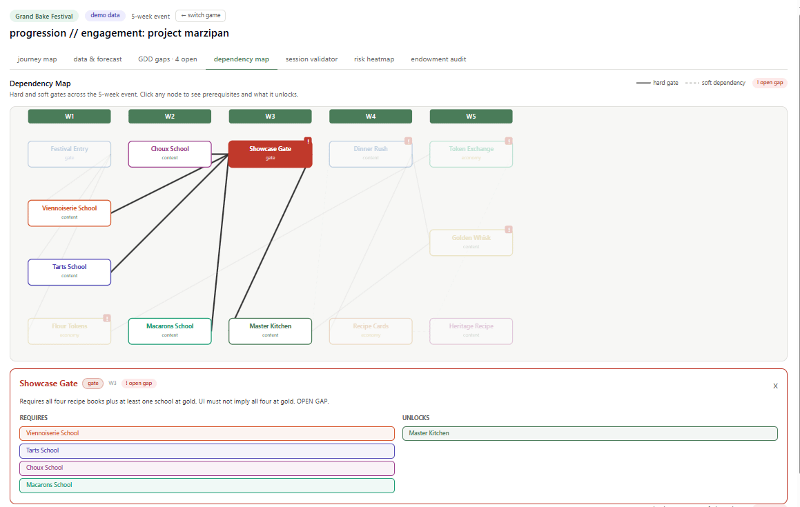
I want to be precise about what happened there, because it is the whole argument of this post. No AI magic found that risk. Arithmetic found it, plus a dependency map that made a requirement visible enough to notice its ambiguity. The tool’s contribution was structural: it put the session math, the gate requirements, and the player segments in the same view, which is exactly what my five open tabs never did.
The decisions that stopped living in meeting notes. Every event in development carries a cloud of open questions. Economy tuning rates. Party sizes for group content. Asset approvals from partners. In my experience these live in meeting notes and memory, and they surface at the worst time, which is implementation. The gap tracker gave them a structure: each one logged with what it blocks, who owns it, and its status. By the time we sat down with our partner studio, fourteen open decisions were on one screen instead of scattered across a month of call summaries. Several were the kind that block implementation scope, the sort of thing that costs a sprint when discovered late.
Risk, concentrated and named. The risk heatmap crosses each week of the event against each player segment, blending structural analysis of the design with sentiment from the journey map.
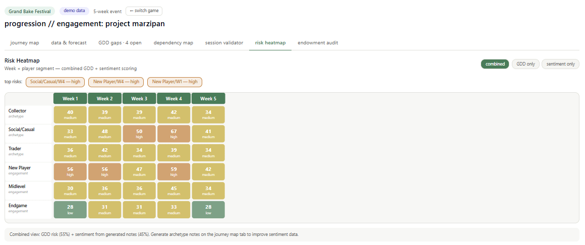
Five cells lit up, concentrated in two segments: new players across the opening weeks and again at the group content, and casual players at that same week three gate and in the late event fatigue stretch. Neither was a surprise exactly. Any experienced producer would have circled those areas on instinct. The difference is that instinct is hard to defend in a design review, and a heatmap with visible reasoning is not. It moved the conversation from whether we had a problem to what we were doing about it.
None of this replaced playtesting, and none of it will. What it changed is when the finding happened. Every one of these issues would have surfaced eventually. In testing, or worse, in live data. Finding them at the planning stage cost a weekend of building and a few hours of use. Finding them in week three of a live event costs the event.
What it does not do
I want to be equally precise about the limits, because this is where most posts about AI tools lose me.
The forecasts are ballpark math, not analytics. The tool multiplies baseline numbers by assumption multipliers and adjusts by sentiment. That produces a directional read, useful for spotting that week four looks soft relative to week three. It does not produce numbers you should put in front of a finance team. I built in a view for entering actual live data precisely because the forecast is a hypothesis, and hypotheses need checking.
The AI generated content is a draft, always. It writes a plausible player scenario from the design context, and plausible is the right word. It is only as good as the context I feed it, and it needs a producer’s edit every time. Where it genuinely helps is the blank page problem: editing a decent draft of twenty cells is far faster than writing twenty cells.
The sentiment scoring is keyword arithmetic, not psychology. It notices words like frustration and fatigue and adjusts a score. It is a rough proxy that happens to be useful when blended with structural analysis. I would not defend it as a measure of anything on its own.
And the deepest limit: the tool cannot know what is not in the design. It surfaced the gate ambiguity because the requirement was mapped. Whatever we failed to map, it failed to check. A planning tool amplifies the judgment of the person using it. It does not substitute for it.
The bigger point
Here is the part that generalizes beyond game production.
The tool I described was never going to exist commercially. The market is too small, the workflow too specific, the buyer too niche. For my entire career, that was the end of the analysis. Domain experts lived with generic tools because specific ones did not pencil out for anyone to build.
That equation just changed. The cost of building a bespoke internal tool collapsed from a team and a quarter to a person and a weekend. Not for everything, and not to production grade in the enterprise sense. But to the grade where it does real work: surfaces real risks, structures real decisions, sits at the center of a real partner sync.
The scarce ingredient in useful software is now domain knowledge, not engineering.
The person best positioned to build a producer’s tool is a producer. This was always true and always useless, because producers do not ship software. What changed is the distance between understanding a problem and having working software. I designed every view in that canvas around questions the project was actually asking. The code was the easy part, and I say that as the person who wrote the prompts, reviewed every line, and hit plenty of walls along the way.
The config system is what convinces me this is not a one-off. Because the structure of a live event is universal even when the content is not. Weeks, player archetypes, progression gates, open decisions. Ten minutes of configuration points the same canvas at a completely different title. The tool I built for one event is quietly a tool for the category.
I think this pattern repeats everywhere there are experts with well-worn questions and no market for the tool that answers them. Producers, clinicians, teachers, researchers.
Where this goes
I am generalizing the tool so it works for any live event structure, on any title, and I am writing about the process as I go.
If you are a producer and you recognized the tab-switching hour, I would genuinely like to hear what your five tabs are. And if you want to try the canvas on your own event when the general version is ready, reply or subscribe. The first few conversations will shape what it becomes.
The interesting tools of the next few years will not come from vendors. They will come from the people who were alt-tabbing.